Dream Delivery
Tucking In Efficiency and Waking Up Productivity
Introduction
As the Lead UX Designer and Experience Manager at Sleep Number, we embarked on a mission to comprehensively enhance the home delivery experience. By immersing myself in every facet of the customer journey, we sought to identify bottlenecks and areas of improvement.
The Challenge
The homegrown mobile application for delivery and warehouse technicians, along with the archaic customer care system, showed signs of inefficiencies and pain points. There were issues with inventory management, a convoluted returns process for warehouse and delivery technicians, forced app timeouts leading to data loss, and insufficient feedback mechanisms, among other concerns.
The Research
To gain a holistic understanding, we conducted the following activities:
- Observational Research: we rode along with delivery technicians, witnessed firsthand home deliveries, observed warehouse technicians using our proprietary mobile app, and shadowed customer care agents.
- Stakeholder Interviews: we held time with several key stakeholders along the supply chain & logistics spaces, listening to their pain points and concerns with how the current, physical process was performing.
- Service Blueprint: All of the information gathered along the way lead me to map out an end-to-end service blueprint, which spanned from order placement, to delivery, to product setup, and into the return/exchange process.

The Solution
Mobile App Redesign
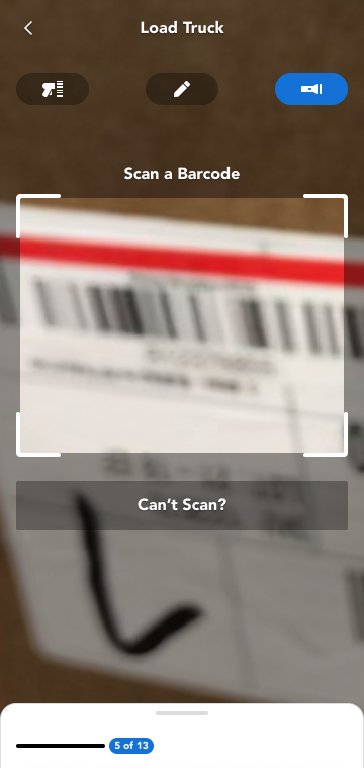
While improved inventory management was the foremost concern, accessibility, consistency, and usability was paramount. we redesigned all the mobile app screens to ensure a smoother and more intuitive user experience using a component-based, atomic design approach.
Streamlined Returns
To mitigate physical inventory loss, we crafted a direct returns process within the app.
Session Management
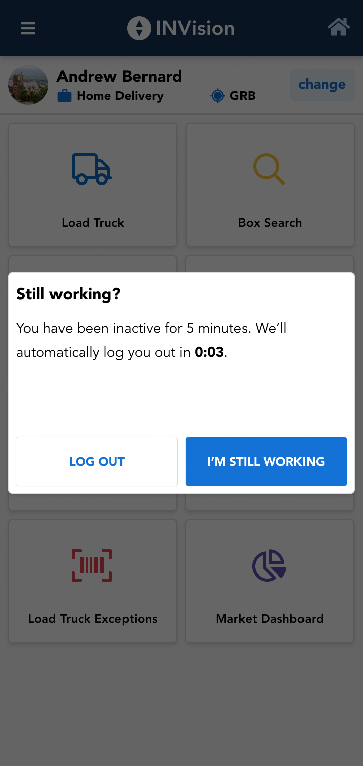
I implemented a “still working?” prompt, addressing the critical issue of the app logging users out, which previously led to data loss.
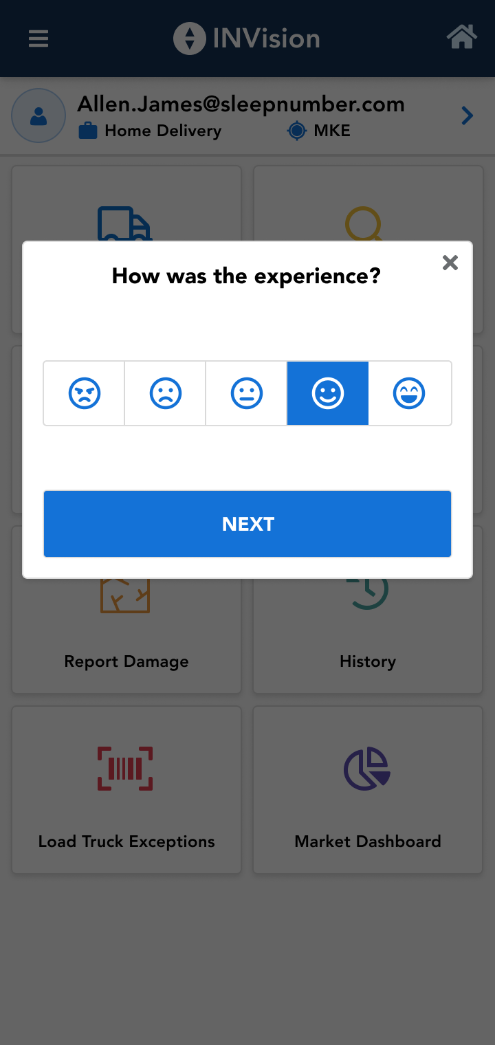
Feedback Integration
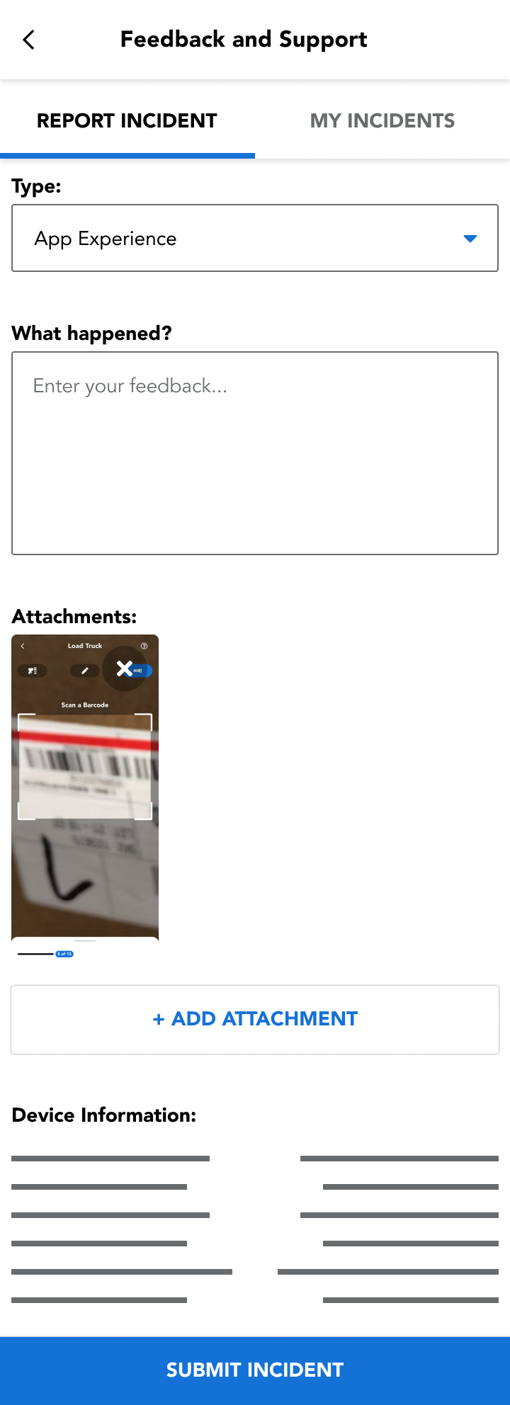
A new help and feedback flow was introduced, allowing for continuous improvement suggestions when in-depth observations or testing wasn’t feasible.
Gamification
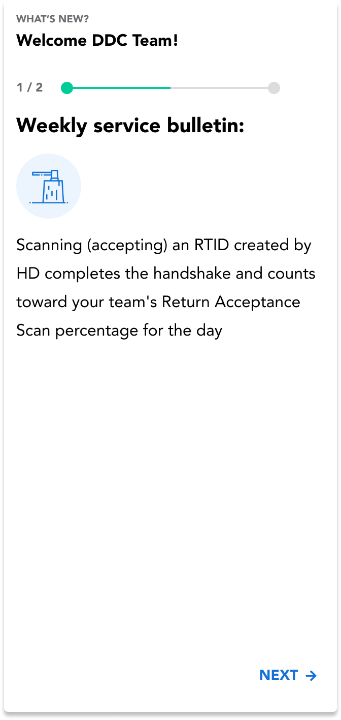
I added a gamification element to foster compliance with the revamped returns process. The goal was to make “error-free” returns a collective objective.
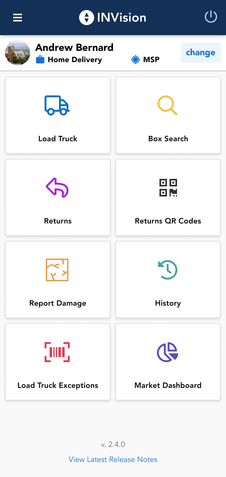
User Profiles for Smaller Markets
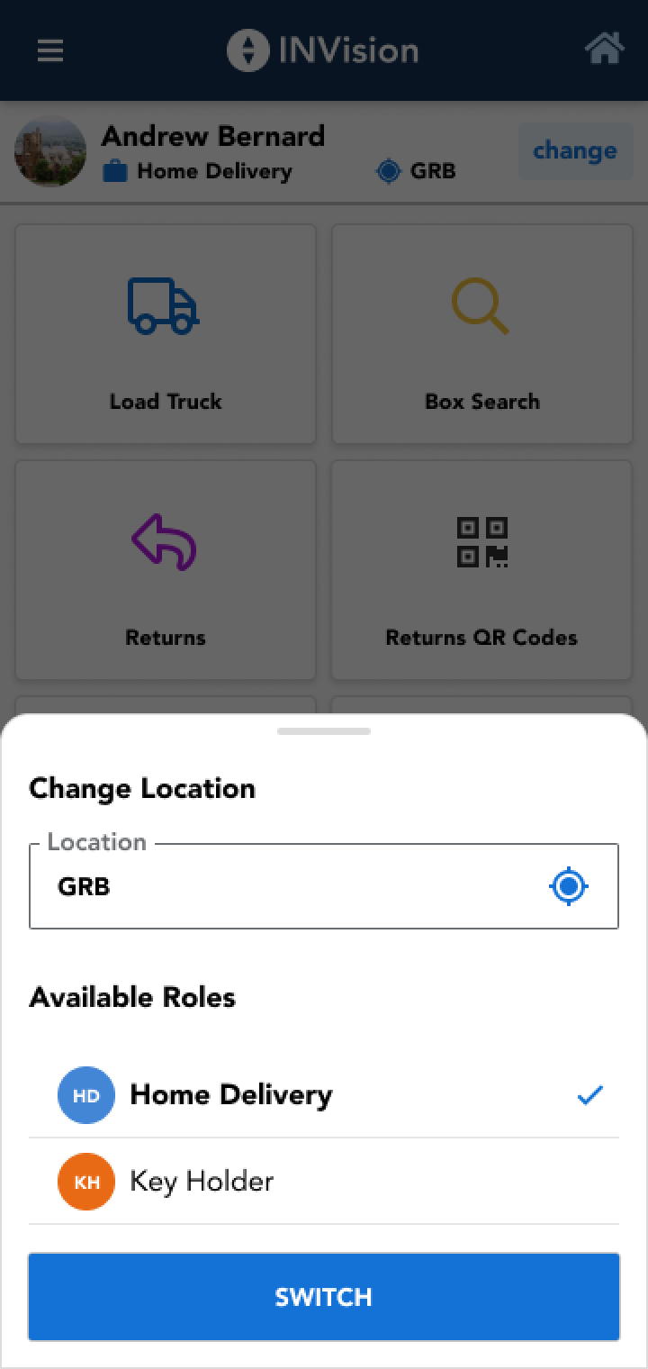
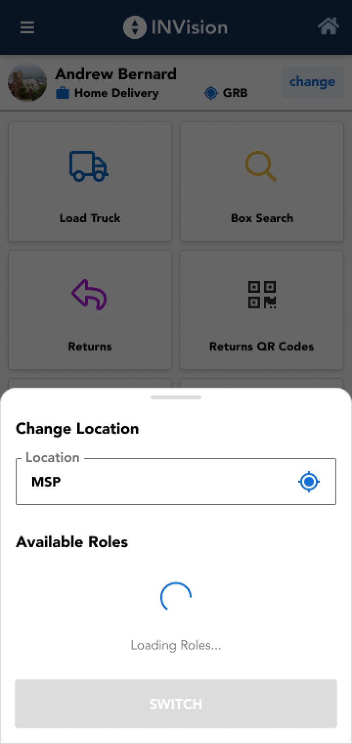
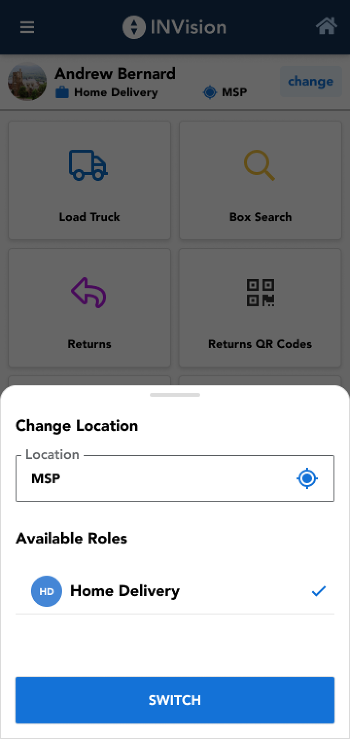
Given the unique dynamics of smaller markets, “super users” were enabled, who could efficiently switch between profiles without logging out of the application.
Customer Care Wizard UI
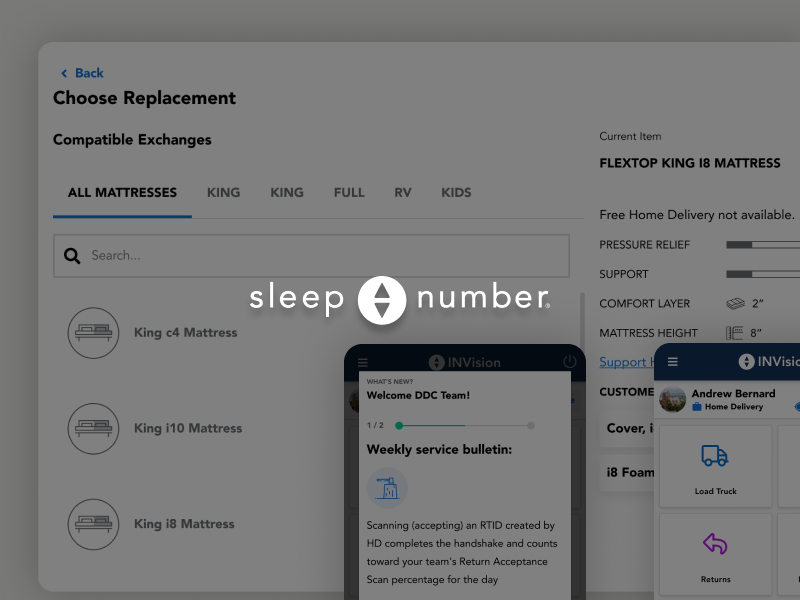
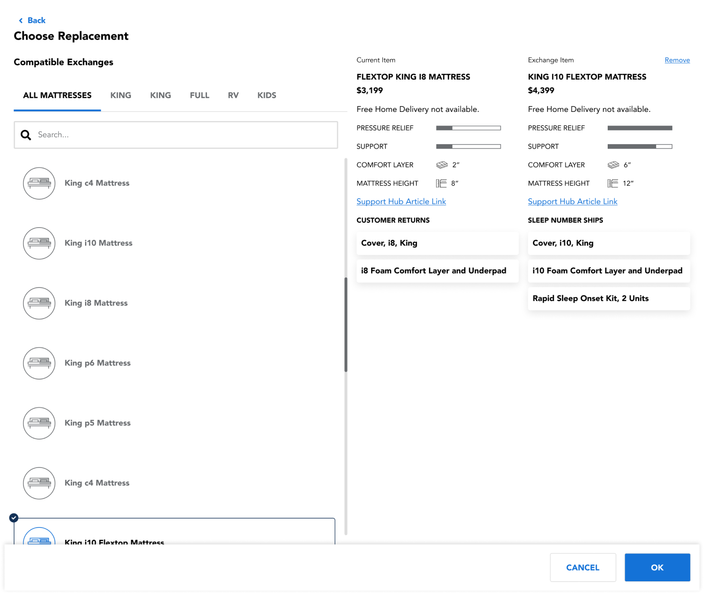
I designed an interactive wizard UI to guide customer care agents. This interface made facilitating customer exchanges more straightforward, preventing returns, preserving sales, and ensuring customer satisfaction.
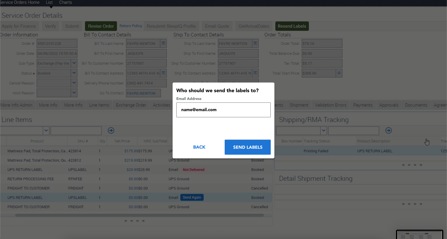
Improved Return Label Generation
Finally, we addressed a significant pain point in the return process. Now, customer care agents could generate return labels seamlessly, eliminating the previously common issue of having to resend them.
The Outcome
Post-implementation, Sleep Number witnessed:
- A significant drop in physical inventory loss.
- Improved efficiency among delivery and warehouse technicians.
- Stronger delivery and warehouse technician confidence in using the app.
- Enhanced customer satisfaction due to reduced errors and more efficient exchanges.
- Increased agent productivity and fewer issues with label resending.
Conclusion
By diving deep into the heart of Sleep Number’s home delivery experience, the team was able to identify core issues and implement strategic solutions. The comprehensive overhaul not only made the system more efficient but also significantly enhanced user experience and customer satisfaction. This project underscored the importance of hands-on experience and observation in crafting effective UX solutions.
