Mobile, Web, Research
Dream Delivery
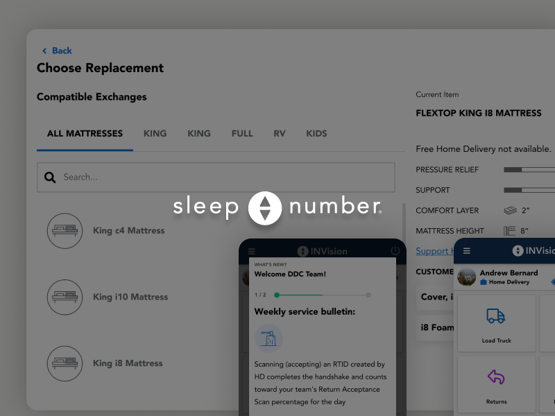
How a field research-driven redesign reduced inventory loss and restored technician trust at Sleep Number
Unifying a fragmented enterprise fleet platform to drive self-serve adoption and reduce sales-assisted onboarding at J.J. Keller
J.J. Keller Encompass is a full-service fleet management platform serving carriers across the US and Canada. The product worked. But ‘works if someone shows you how’ is a dangerous place to be in a competitive SaaS market.
The tell was in a single user quote from research:
After [the salesperson] showed me how to get there, it was easy to remember.
That’s not a compliment. That’s a retention risk. A product that requires a human to unlock its value is a product with a leaky funnel and a customer success team absorbing costs that should be absorbed by the UI.
The mandate was a redesign. The real problem was activation and self-serve confidence.
Senior Product Designer. I led the UX workstream — research, IA, design system, and visual redesign — in close collaboration with product and engineering.
We started with a UI inventory — a full audit of every screen, pattern, and navigation state in the product. This gave us a factual baseline rather than opinions about what was broken.
Card sorting exercises revealed how users actually categorized the product’s functionality — not how the original IA assumed they would. The gap between the two was significant.
We then interviewed existing users alongside internal Customer Care and Sales associates. Sales knew where users got stuck because they spent their days unsticking them. Customer Care knew which features generated the most support tickets. Both groups were an underutilized source of product intelligence.
Three themes surfaced consistently: users couldn’t find things, the UI felt dated and untrustworthy, and data manipulation was harder than it needed to be.
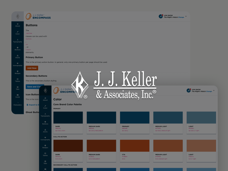
The original nav was organized around how the product was built, not how fleet managers thought about their work. Card sorting data informed a restructured IA that matched user expectations — reducing the need for a salesperson to serve as a human sitemap.
Rather than reskinning screens one at a time, we invested in a component-based design system — an atomic approach that created consistency across the product and gave engineering a reliable, reusable foundation. This wasn’t just a design deliverable — it was infrastructure that reduced future design and dev debt.
We extended the brand palette using systematic tints and shades to meet accessibility standards. Encompass’s user base includes operators working in variable lighting conditions on job sites. Accessible design here was functional design.
Filtering, sorting, bulk actions, and exports were inconsistent across the product. Standardized patterns reduced cognitive load for power users managing large fleets.
Navigation restructure reduced reliance on sales-assisted onboarding — users could orient themselves without a guided tour.
Design system established as the foundation for all future Encompass development, reducing design inconsistency across teams.
Product moved from ‘taught’ to ‘learnable’ — the north star framing that guided every design decision.
This project is a good example of the difference between a redesign and a re-platforming. The visual refresh was visible. The IA restructure and design system were the work that actually mattered — because they changed what was possible for every team that came after us.
The research was strong. Where we left value on the table was in establishing measurable activation and retention baselines before launch. Task success rate testing during the card sort phase would have given us a tighter before/after story.
How a field research-driven redesign reduced inventory loss and restored technician trust at Sleep Number